Day 3: Data visualization with ggplot2 package
Taste of ggplot2 package
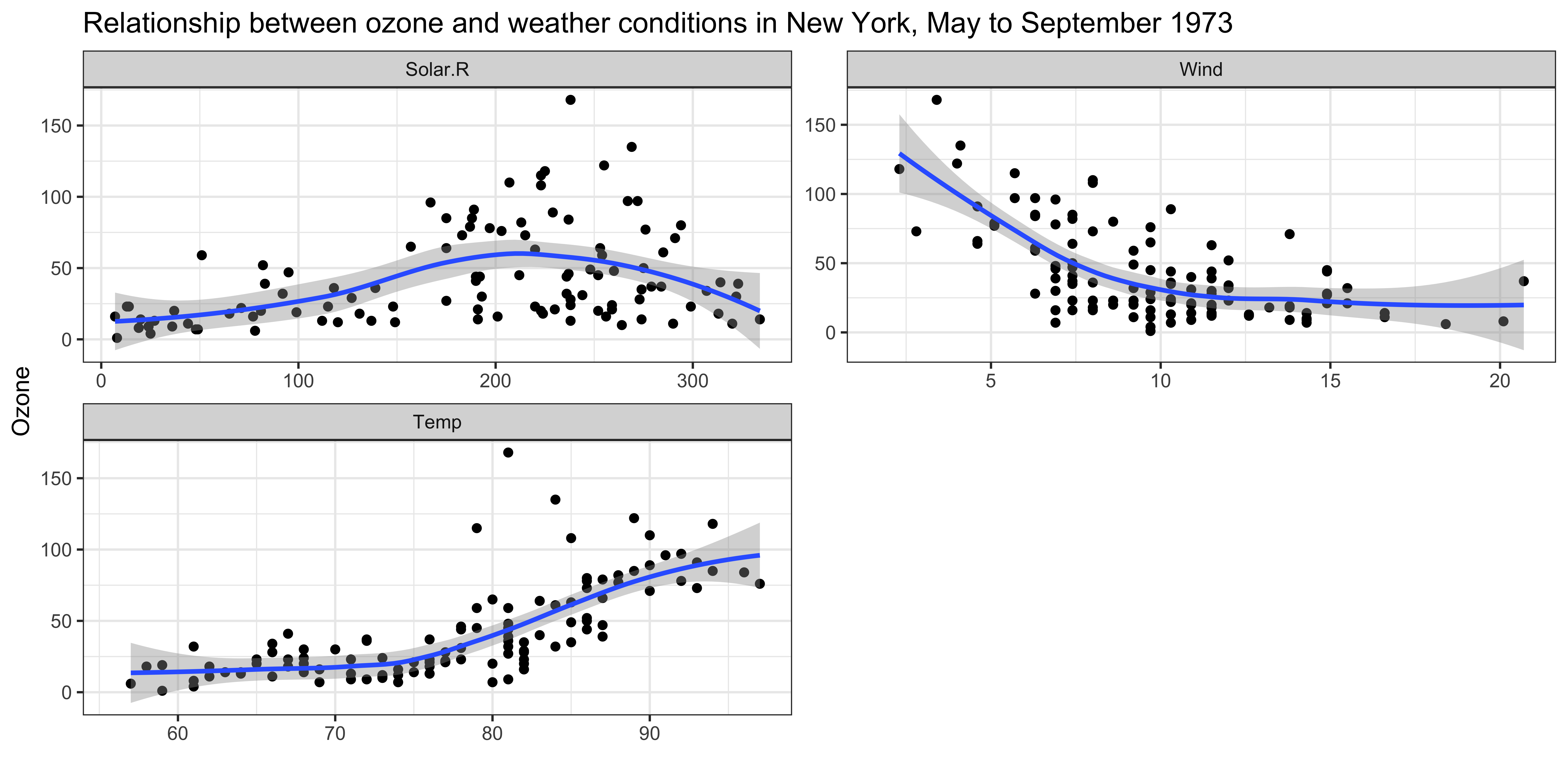
By the end of the lecture, you will be able to create the figures like the following examples using ggplot2 package.
Anatomy of ggplot2
- Use the right-arrow (or down-arrow) key to move through the steps. The left column shows the code. The right column shows the plot it produces. Watch how the plot changes each time a new line of code is added.

# Create a canvas for the plot
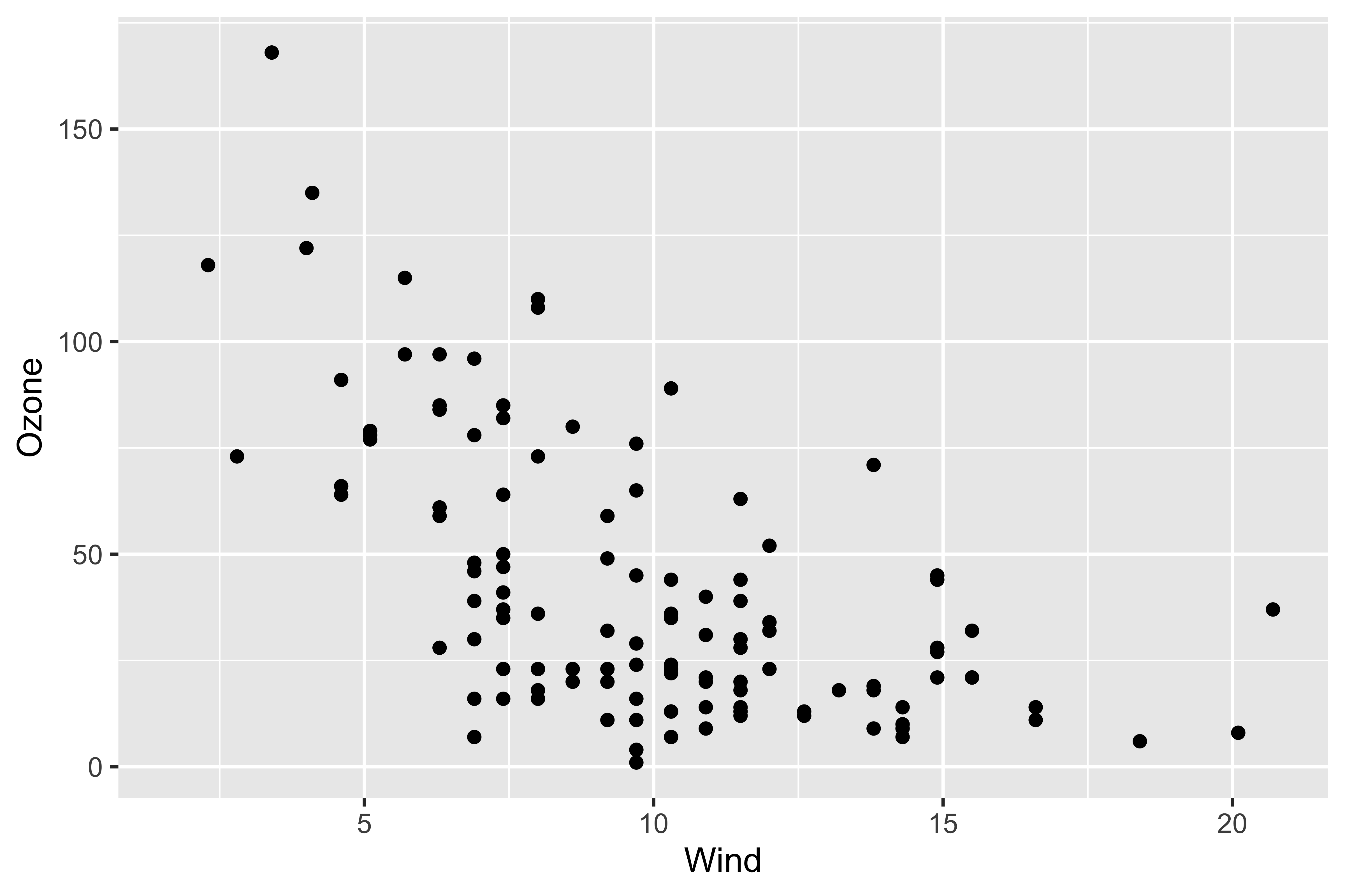
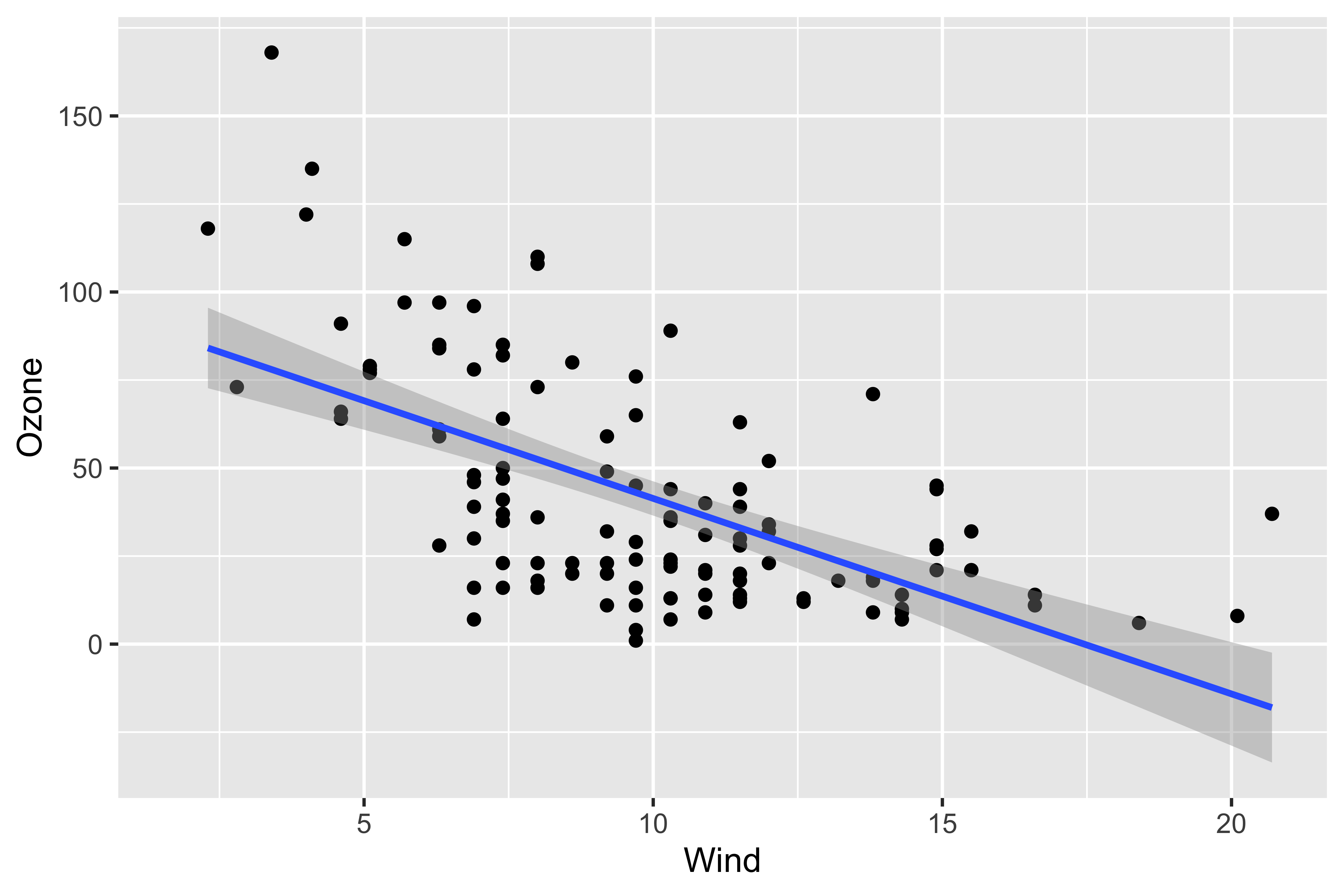
ggplot(data = airquality) +
# Add x-axis
aes(x = Wind) +
# Add y-axis
aes(y = Ozone) +
# Add a scatter plot
geom_point() +
# Add a regression line
geom_smooth(method = "lm") +
# Change x-axis label
labs(x = "Wind Speed (mph)") +
# Change y-axis label
labs(y = "Ozone (ppb)") 
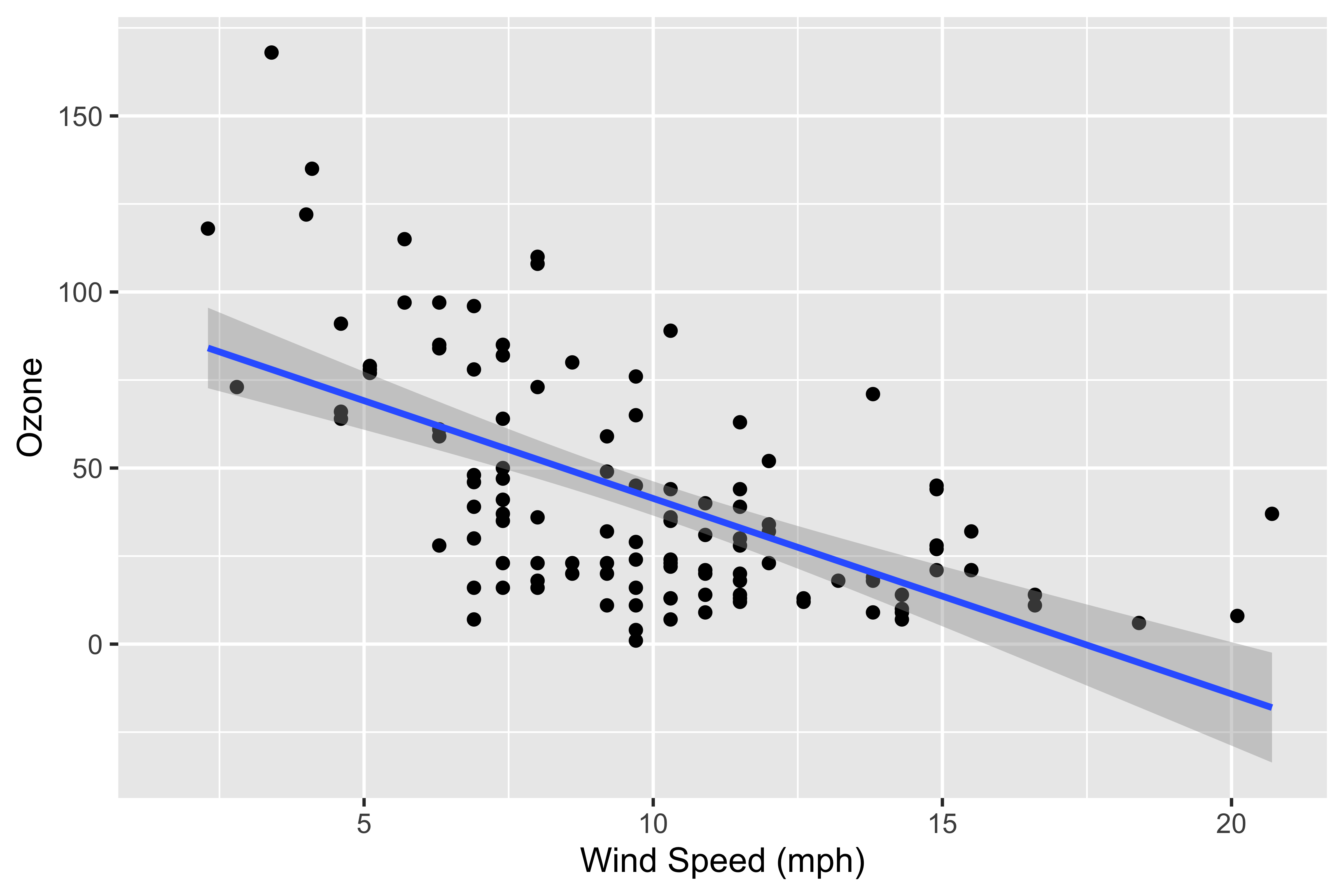
# Create a canvas for the plot
ggplot(data = airquality) +
  # Add x-axis
aes(x = Wind) +
# Add y-axis
aes(y = Ozone) +
# Add a scatter plot
geom_point() +
# Add a regression line
geom_smooth(method = "lm") +
# Change x-axis label
labs(x = "Wind Speed (mph)") +
# Change y-axis label
labs(y = "Ozone (ppb)") +
# Add title and subtitle
labs(
title = "Relationship between ozone and wind speed in New York",
subtitle = "May to September 1973"
)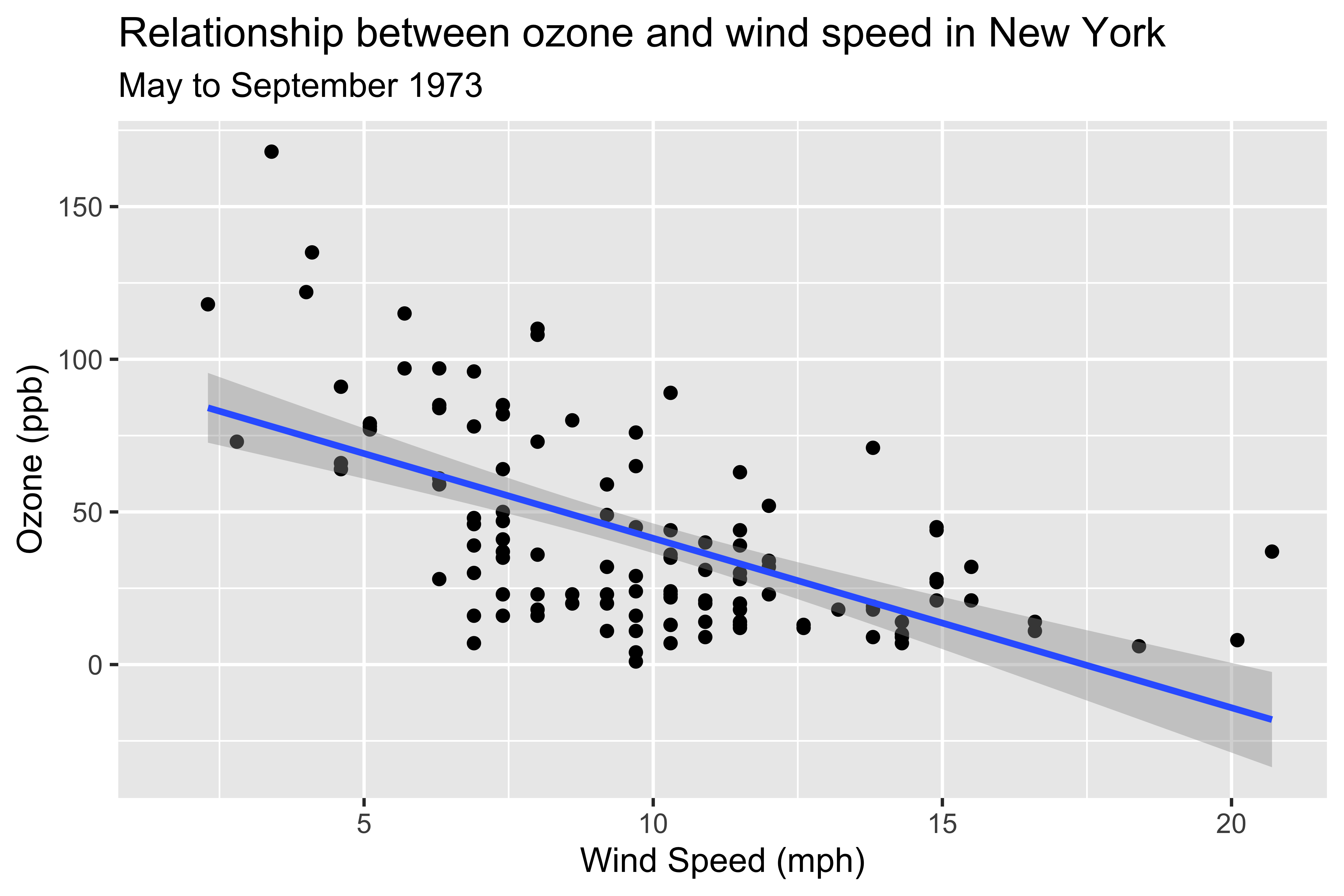
# Create a canvas for the plot
ggplot(data = airquality) +
  # Add x-axis
  aes(x = Wind) +
  # Add y-axis
aes(y = Ozone) +
# Add a scatter plot
geom_point() +
# Add a regression line
geom_smooth(method = "lm") +
# Change x-axis label
labs(x = "Wind Speed (mph)") +
# Change y-axis label
labs(y = "Ozone (ppb)") +
# Add title and subtitle
labs(
title = "Relationship between ozone and wind speed in New York",
subtitle = "May to September 1973"
) +
# Add caption
labs(caption = "Data source:")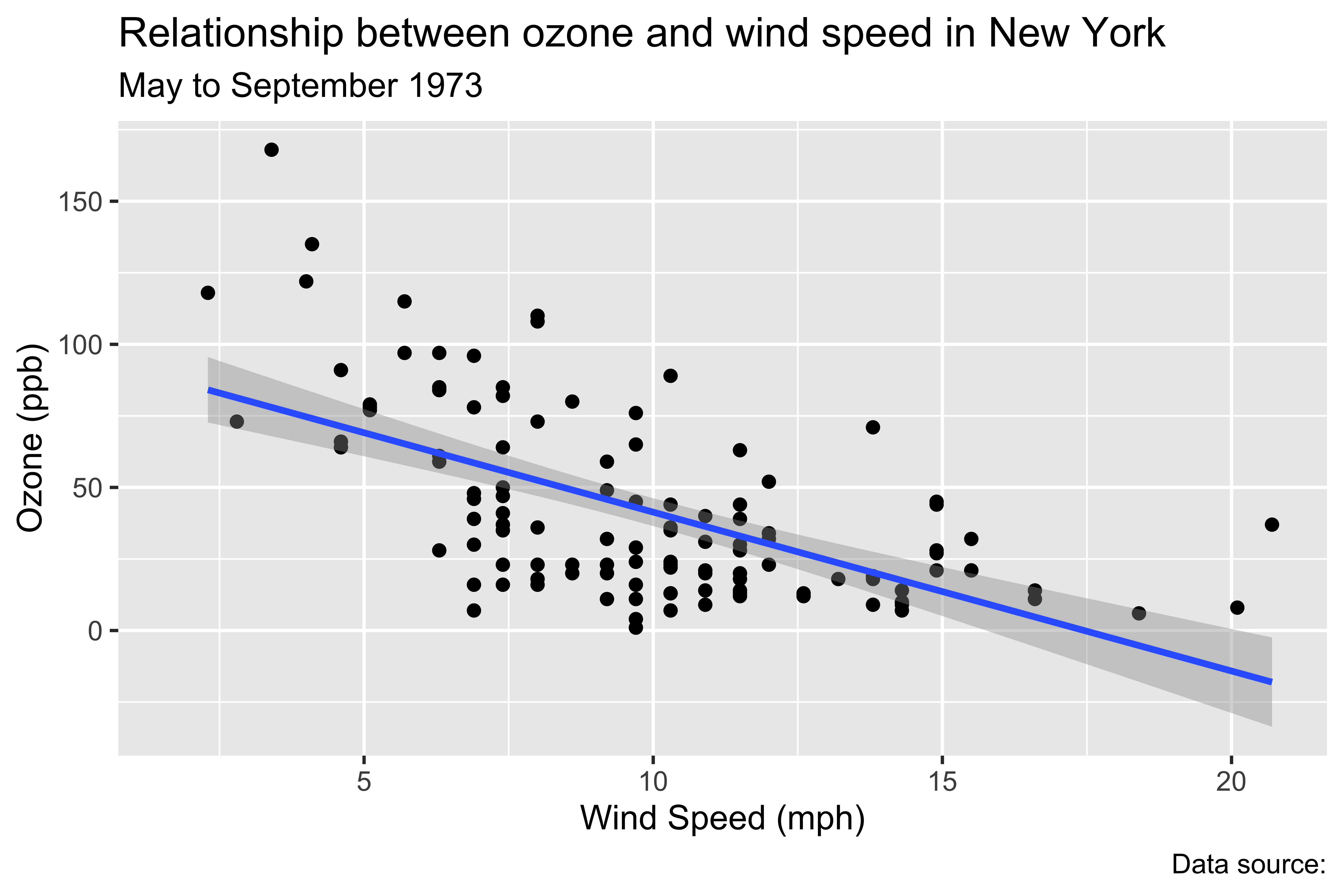
# Create a canvas for the plot
ggplot(data = airquality) +
  # Add x-axis
  aes(x = Wind) +
  # Add y-axis
  aes(y = Ozone) +
  # Add a scatter plot
geom_point() +
# Add a regression line
geom_smooth(method = "lm") +
# Change x-axis label
labs(x = "Wind Speed (mph)") +
# Change y-axis label
labs(y = "Ozone (ppb)") +
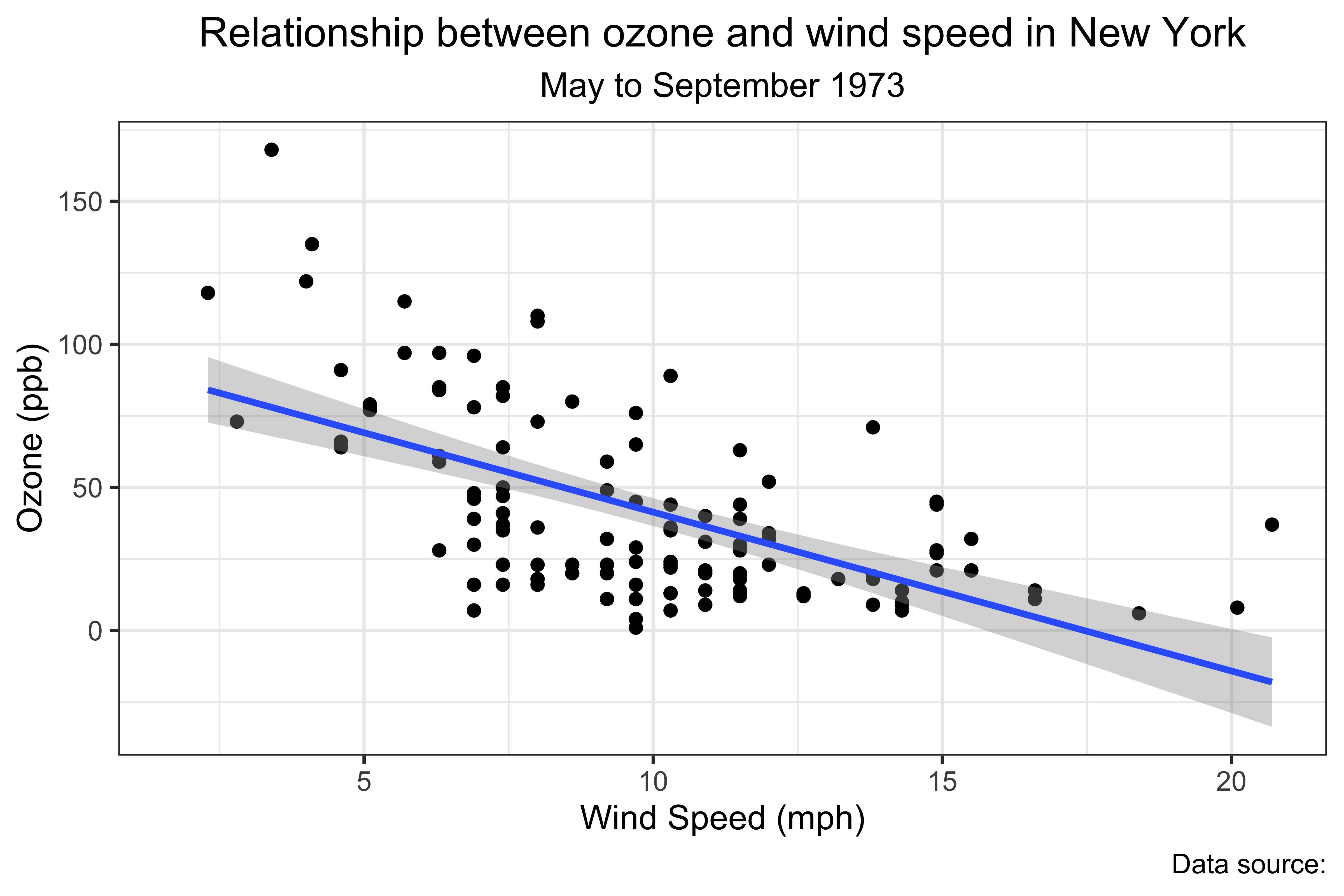
# Add title and subtitle
labs(
title = "Relationship between ozone and wind speed in New York",
subtitle = "May to September 1973"
) +
# Add caption
labs(caption = "Data source:") +
# Set the theme
theme_bw() 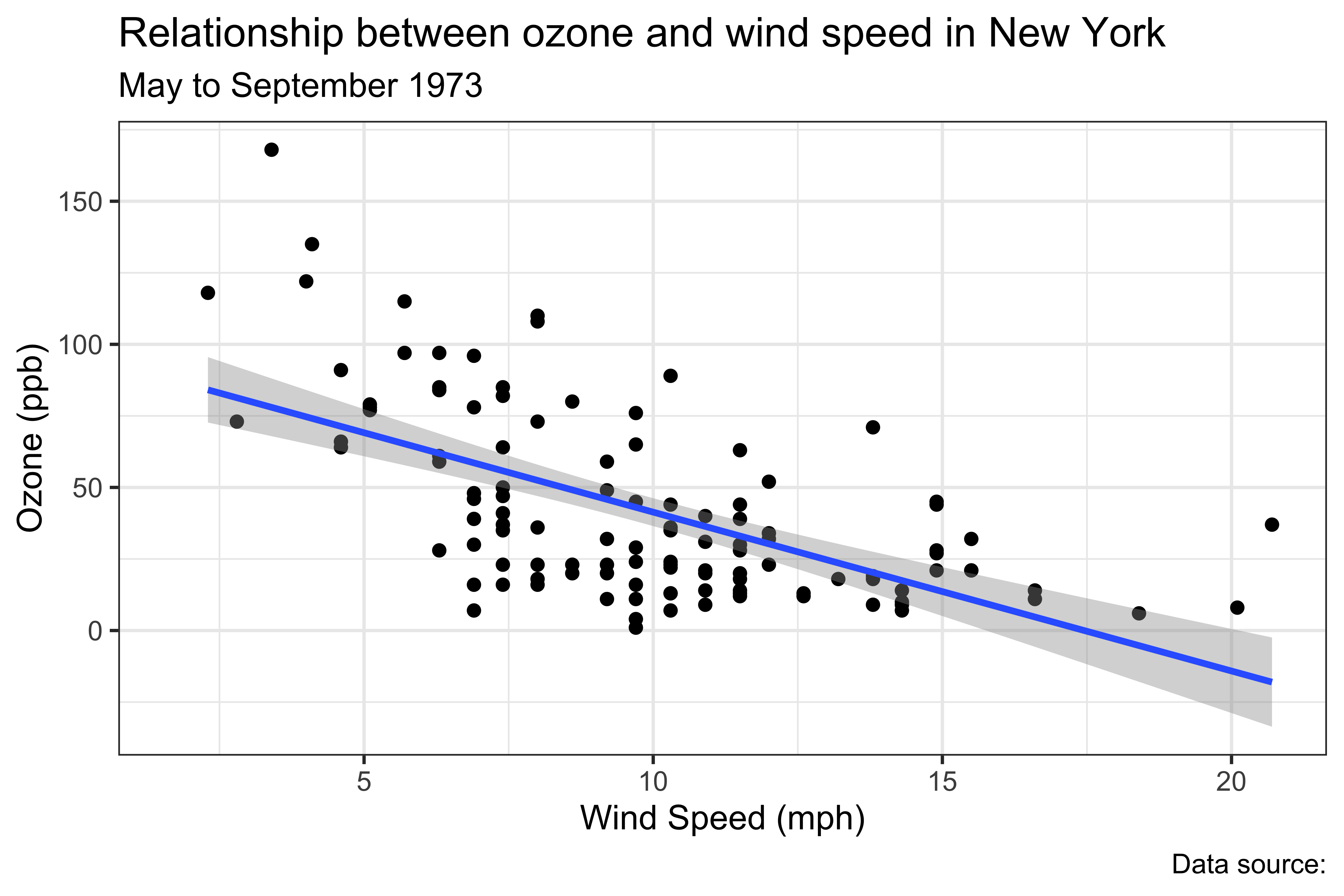
# Create a canvas for the plot
ggplot(data = airquality) +
  # Add x-axis
  aes(x = Wind) +
  # Add y-axis
  aes(y = Ozone) +
  # Add a scatter plot
  geom_point() +
  # Add a regression line
geom_smooth(method = "lm") +
# Change x-axis label
labs(x = "Wind Speed (mph)") +
# Change y-axis label
labs(y = "Ozone (ppb)") +
# Add title and subtitle
labs(
title = "Relationship between ozone and wind speed in New York",
subtitle = "May to September 1973"
) +
# Add caption
labs(caption = "Data source:") +
# Set the theme
theme_bw() +
# Center the title and subtitle position
theme(
plot.title = element_text(hjust = 0.5),
plot.subtitle = element_text(hjust = 0.5)
)
- Note: This code is for demonstration purposes. Don’t imitate this code!
Example
Let’s use the airquality data for this example.
-
airqualitydata is a built-in dataset in R. So, you don’t need to load it. - Type
airqualityin the console to see the data. (Type?airqualityin the console for more information.)
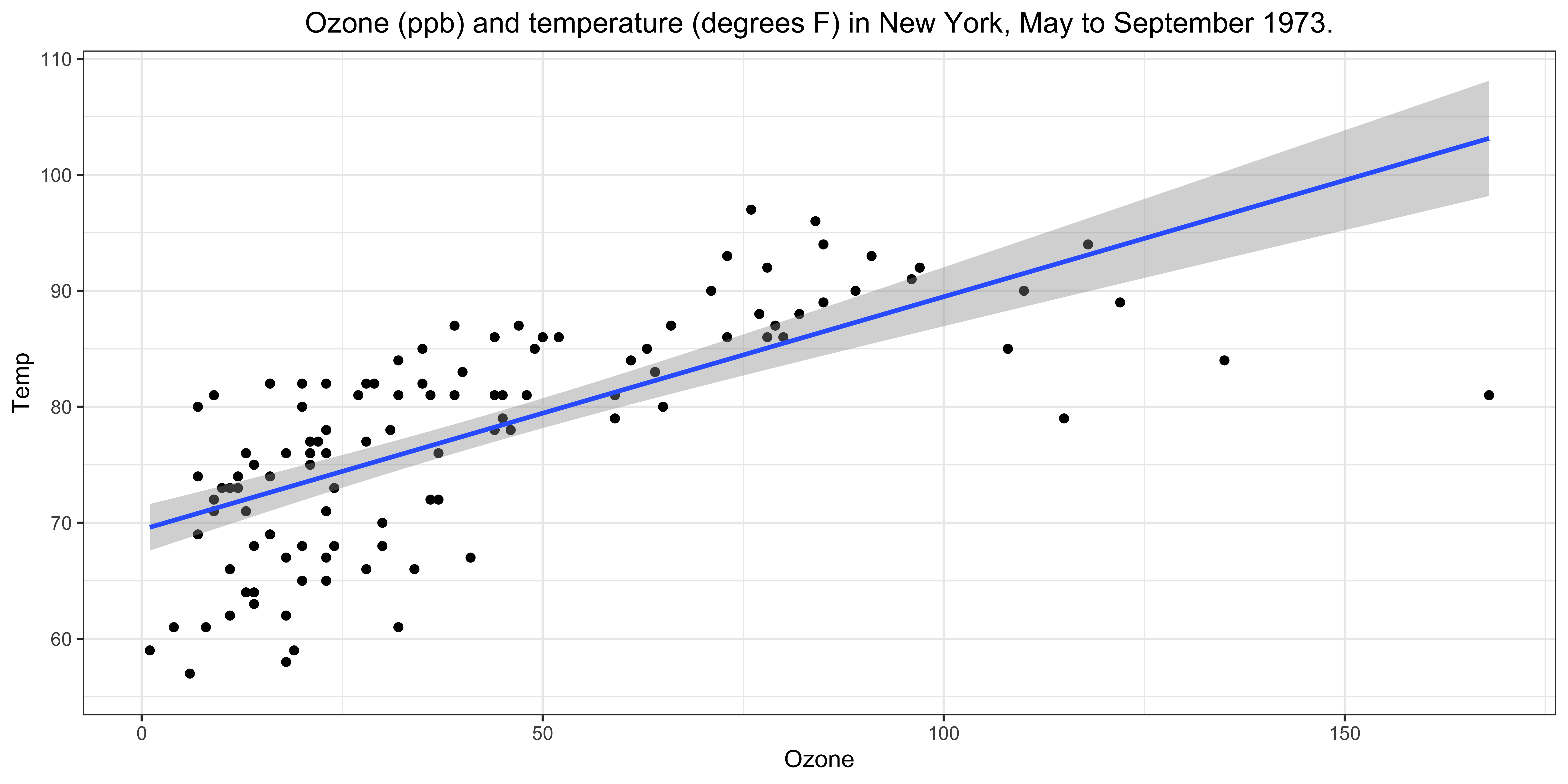
We will create a scatter plot of Ozone (ozone level in the air) and Temp (Maximum daily temperature in degrees \(F\)) from the airquality data.
The final plot should look like the following:
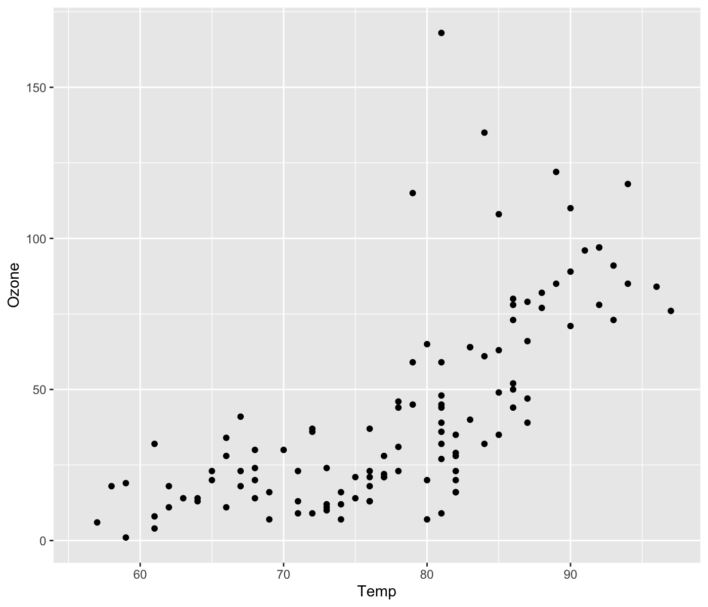
Step 1: Start with ggplot()
-
ggplot(data = dataset)initializes a ggplot object. In other words, it prepares a “canvas” for the plot. - Here, let R know the dataset you are trying to visualize.
Step 2: Draw figures with geom_*() functions, and add to the current canvas use + operator
-
For example, we use
geom_point()to create a scatter plot.- use
aes()to specify which variable you want to use for x and y axis.
- use
aes()is used to tell R to look for the variables inside the dataset you specified inggplot(), and use the information as specified.e.g.,
aes(x = Temp, y = Ozone)tells R to look forTempandOzonein the data, and to map the data to x-axis and y-axis, respectively.
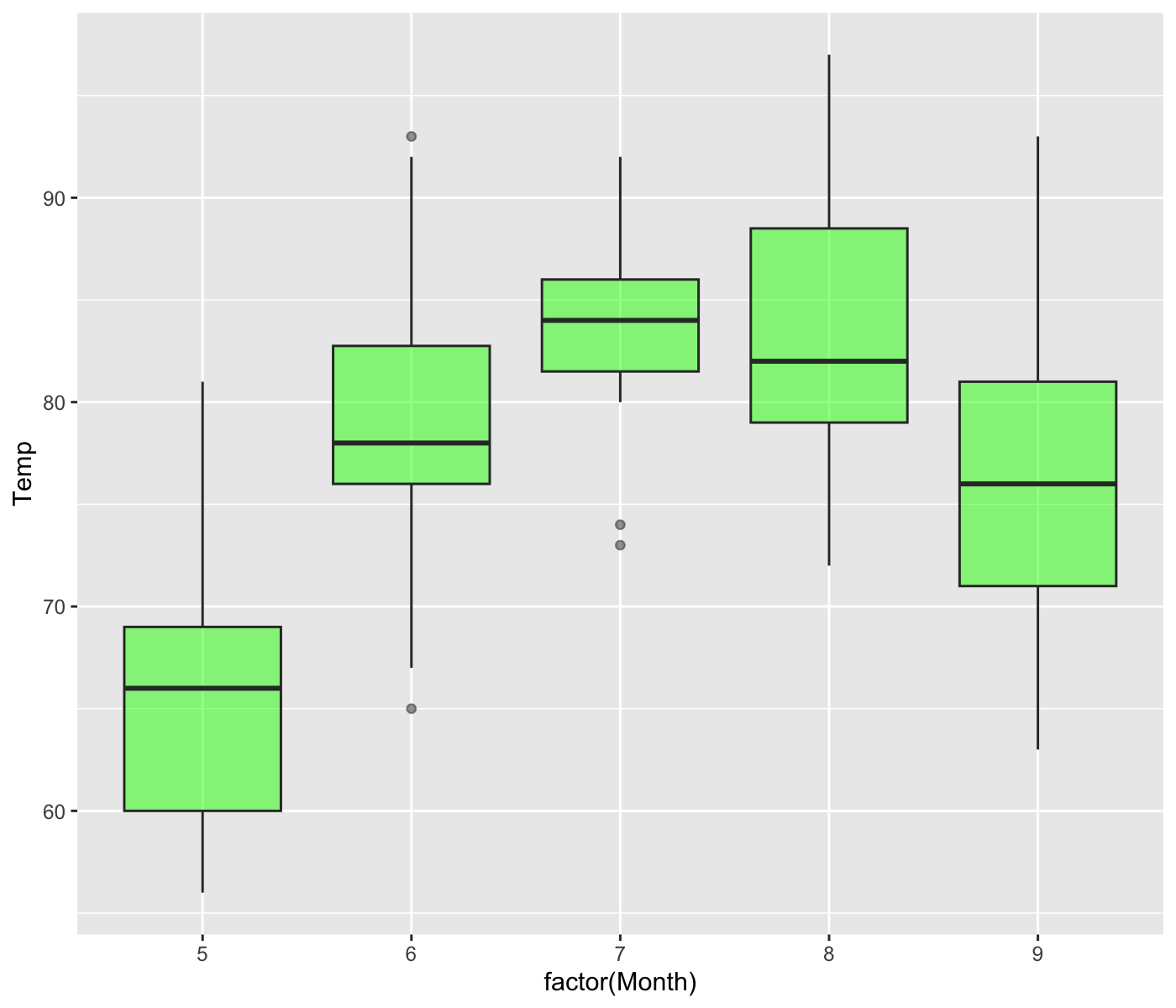
In-class Exercise
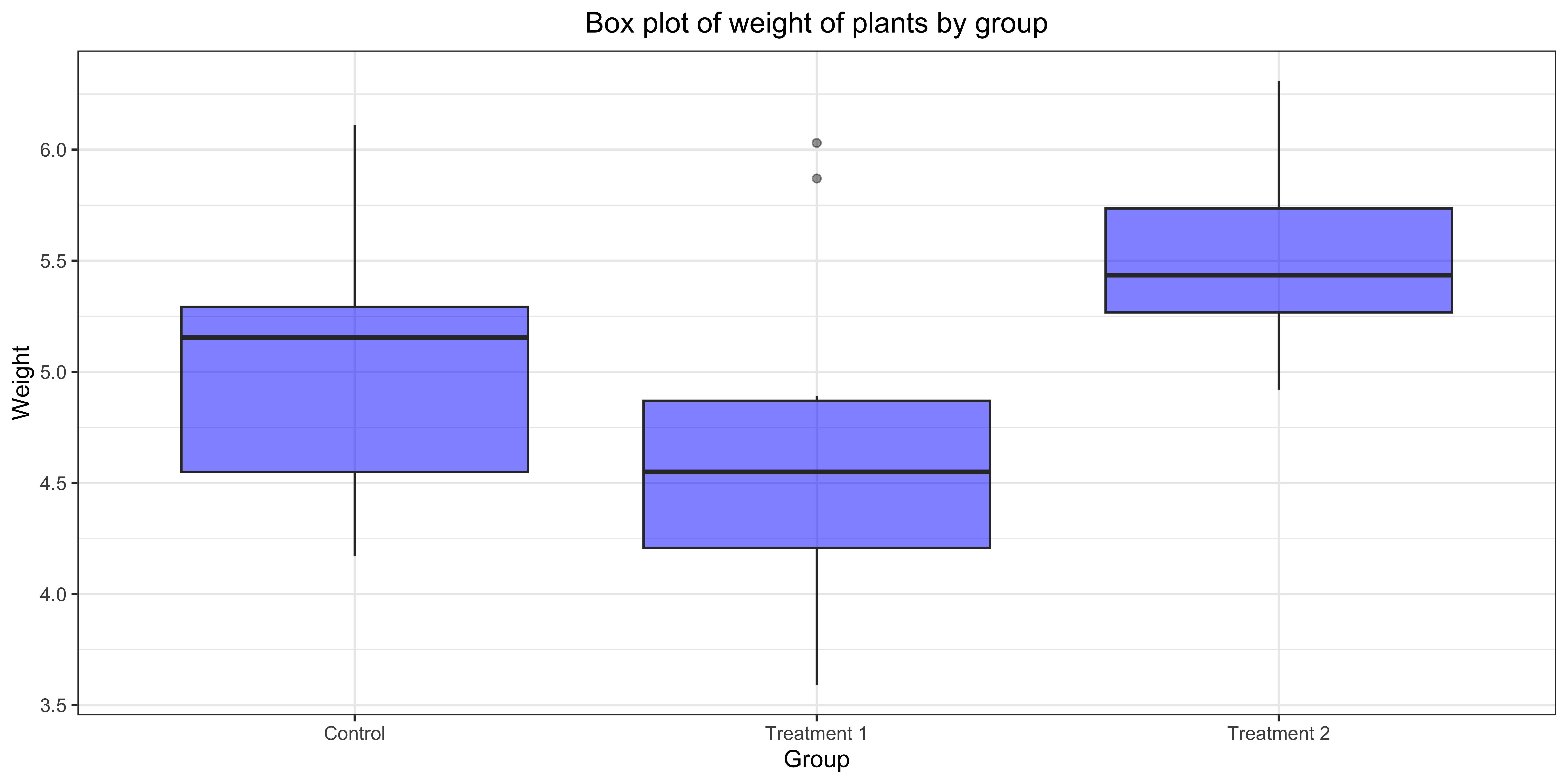
Create box plots of monthly Temp from the airquality data. Fill the boxes with green and make it semi-transparent (use alpha = 0.5).
The figure should look like the following:
Hint
- This is a bit of a tricky problem, but very useful!
- We want to use
Monthas a categorical variable for the x-axis, butMonthis a numeric variable in the data. How can we tell R to use it as a categorical (factor) variable?- Apply
factor()function to aMonthto convert it to a factor variable inaes()in thegeom_*()function.
- Apply
Exercise Problems
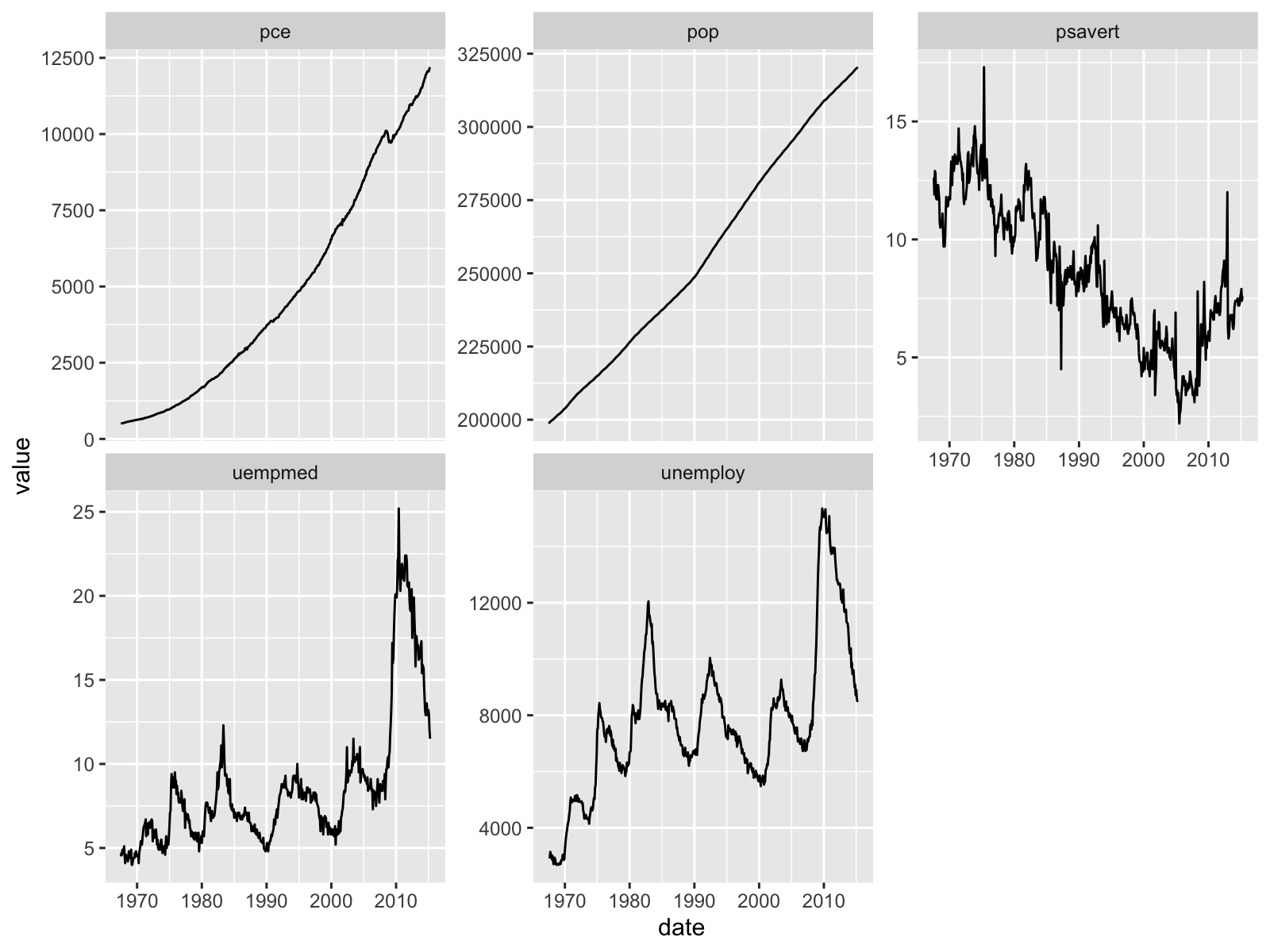
Let’s use the economics data, which is a dataset built into the ggplot2 package. It was produced from US economic time series data available from Federal Reserve Economic Data. This contains the following variables:
-
date: date in year-month format -
pce: personal consumption expenditures, in billions of dollars -
pop: total population in thousands -
psavert: personal savings rate -
uempmed: median duration of unemployment in weeks -
unemploy: number of unemployed in thousands
1. Create a scatter plot of unemploy (x-axis) and psavert (y-axis). Add a simple regression line to the plot. Change the x-axis, y-axis, and fill legend labels to something more informative.
2. Create a bar plot of psavert by date. Use pop for fill color. Change the x-axis, y-axis, and fill legend labels to something more informative.
-
Hint: use
stat = 'identity'in thegeom_bar()function to plot the actual values ofpce.
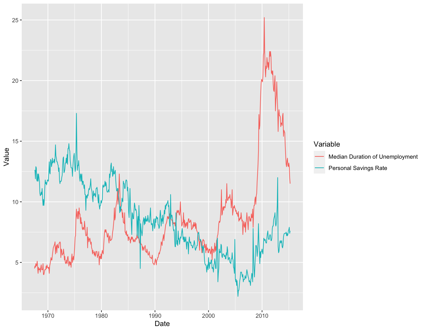
3. (Challenging) Create a multiple line plot taking day as x-axis and psavert and uempmed as y-axis, respectively. The output should look like the following.
- Hint: I think there are multiple ways to do this.
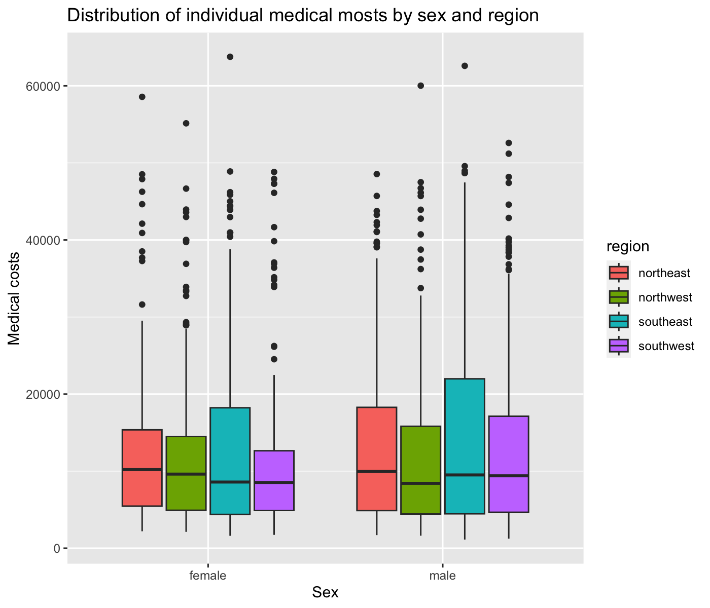
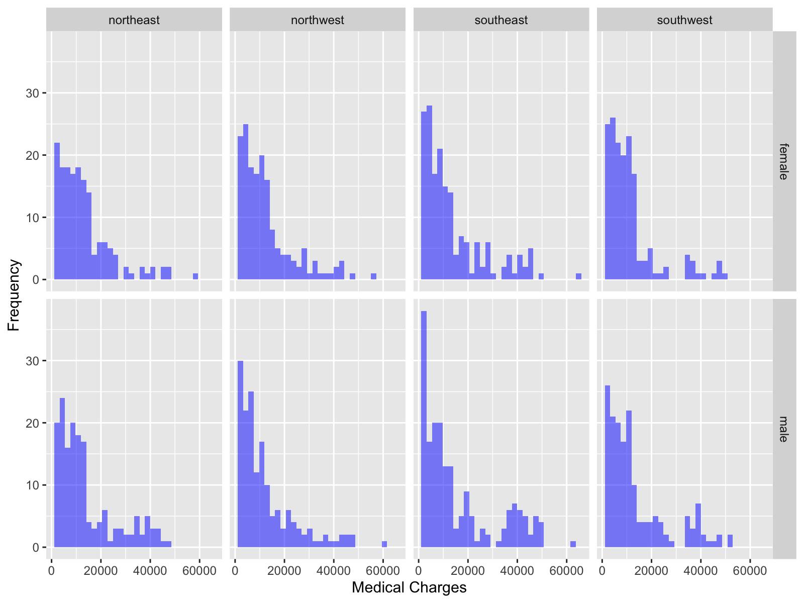
For this exercise problem, we will use medical cost personal datasets descried in the book “Machine Learning with R” by Brett Lantz. The dataset provides \(1,338\) records of medical information and costs billed by health insurance companies in 2013, compiled by the United States Census Bureau.
The dataset contains the following variables:
-
age: age of primary beneficiary -
sex: insurance contractor gender, female, male -
bmi: body mass index, providing an understanding of body, weights that are relatively high or low relative to height -
children: number of children covered by health insurance -
smoker: smoking -
region: the beneficiary’s residential area in the US; northeast, southeast, southwest, northwest. -
charges: individual medical costs billed by health insurance
Download the data
Create a histogram of
chargesbysexin the same plot. Fill the boxes with different colors for eachsex.Create a scatter plot of
bmi(x-axis) andcharges(y-axis).Now, create a scatter plot of
bmi(x-axis) andcharges(y-axis), and add regression lines bysmoke(So, there are two regression lines: one for group of smokers and the other for group of non-smokers).Create the following plot.
Facet Plot
You can partition a plot into a matrix of panels and display a different subset of the data in each panel. This is useful when you want to compare patterns in the data by group.
facet_wrap() makes a long ribbon of panels (generated by any number of variables). You can also wrap it into 2 rows.
Syntax:
- Inside
vars(), specify variables used for faceting groups. -
ncolandnrowcontrol the number of columns and rows (you only need to set one). -
scalescontrols the scales of the axes in the panel (either"fixed"(the default),"free_x", or"free_y","free").
Try it!
Play around with the facet_wrap() function in the code below. See how the choice of faceting groups, number of rows and columns and the scales of the axes affect the appearance of the plot.
facet_grid() produces a 2 row grid of panels defined by variables which form the rows and columns.
Syntax:
- The graph is partitioned by the levels of the groups
var_xandvar_yin the rows and columns, respectively. -
ncolandnrowcontrol the number of columns and rows (you only need to set one). -
scalescontrols the scales of the axes in the panel (eitherfixed(the default),free_x, orfree_y,free).
Try it!
Exercise Problems
For this exercise problem, you will use the gapminder data from the gapminder package.
Find the number of unique countries in the data.
Calculate the mean life expectancy for the entire dataset.
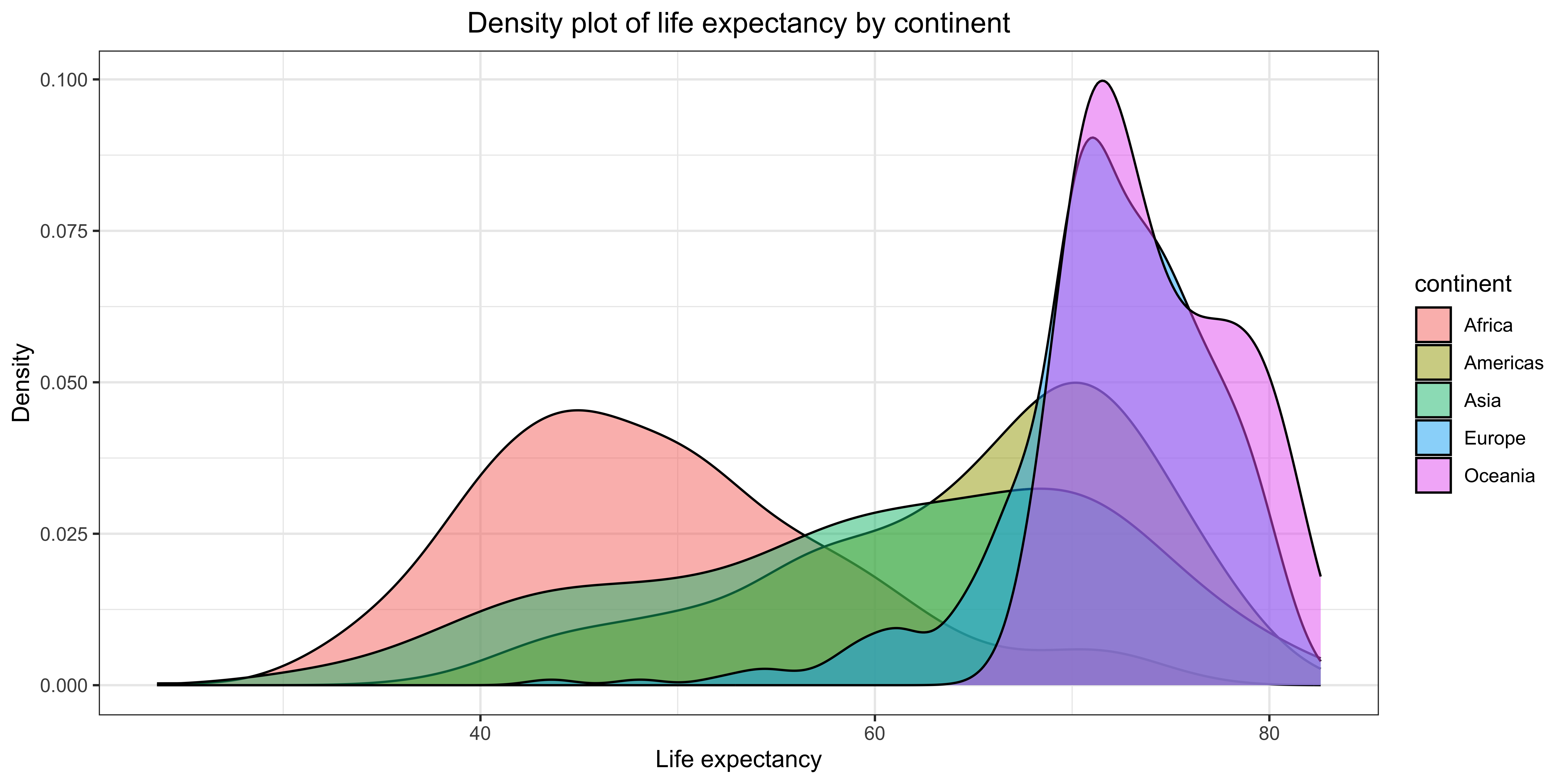
Create a dataset by subsetting the data for the year 2007. Create a scatter plot of GDP per capita vs. life expectancy for the year 2007, color-coded by continent.
Create a bar plot showing the total population for each continent in 2007. Fill the bars with blue and set the transparency to 0.5.
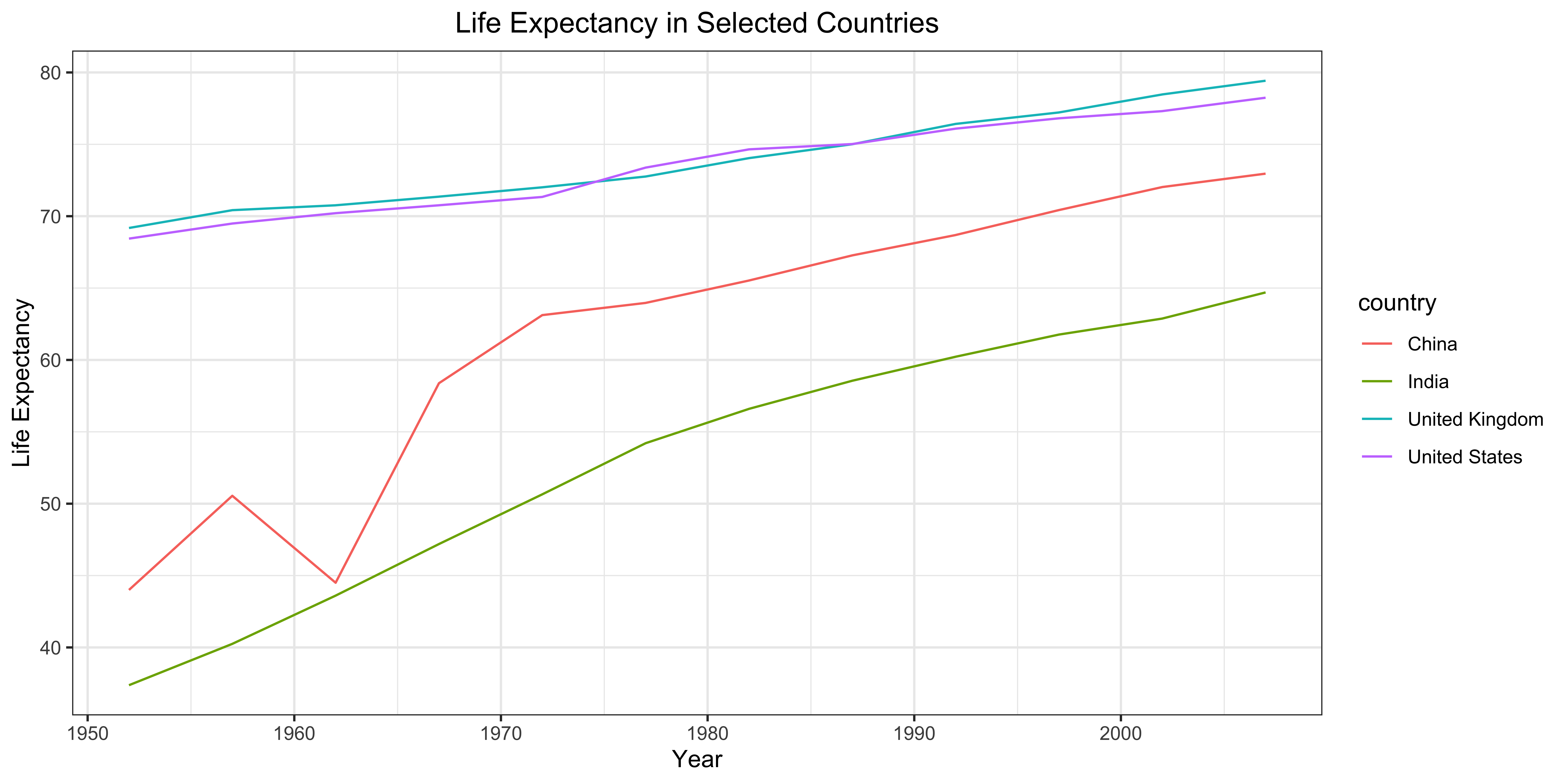
Subset the data for the United States, China, India, and the United Kingdom. Create a line plot showing the change in life expectancy over time for these countries.
Create a scatter plot of GDP per capita vs. life expectancy for the entire gapminder dataset. Use
facet_wrapto create separate plots for each continent.Group the data by continent and calculate the mean GDP per capita for each continent for each year. Create a line plot showing the trend of mean GDP per capita for each continent over time.
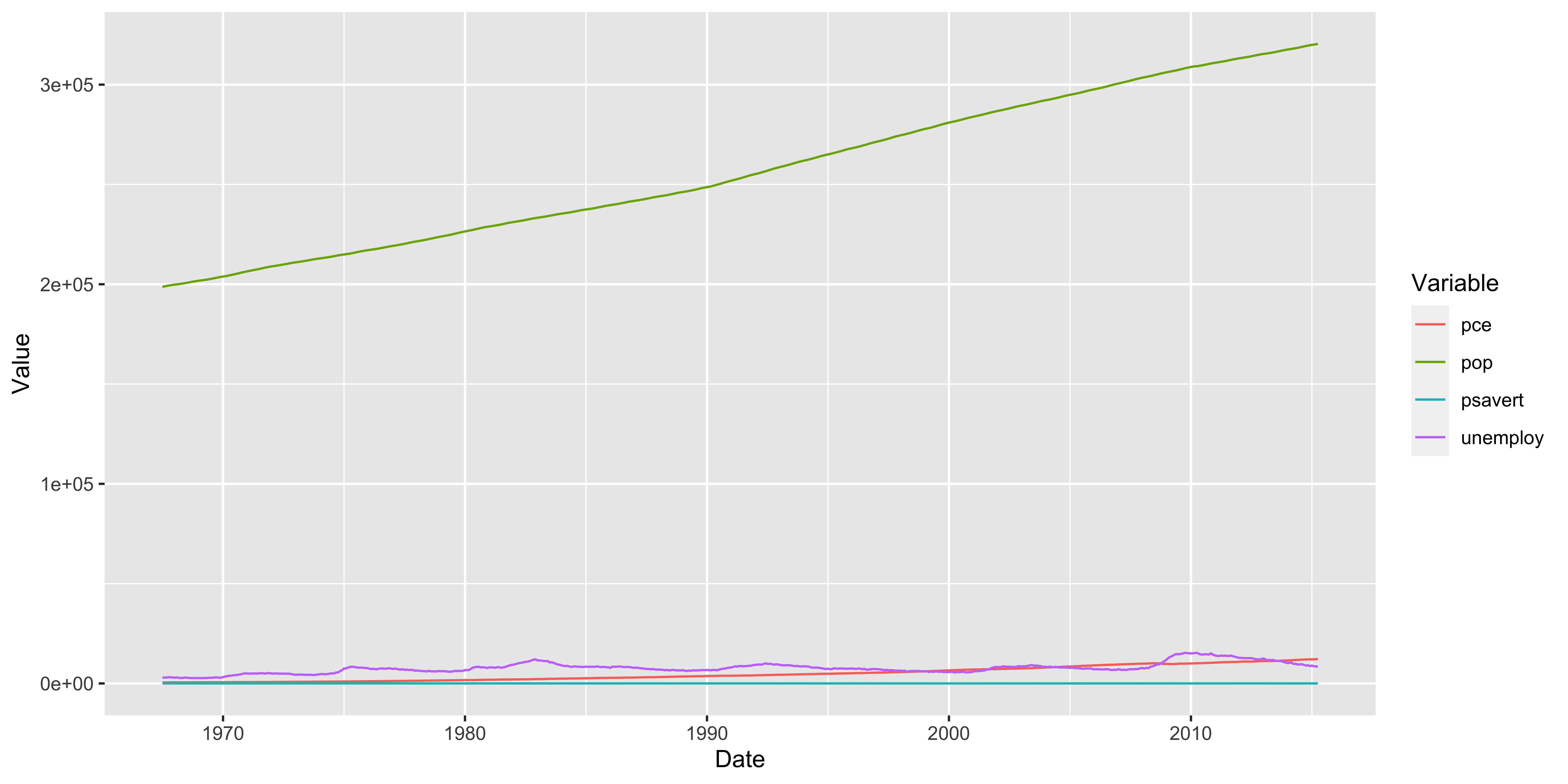
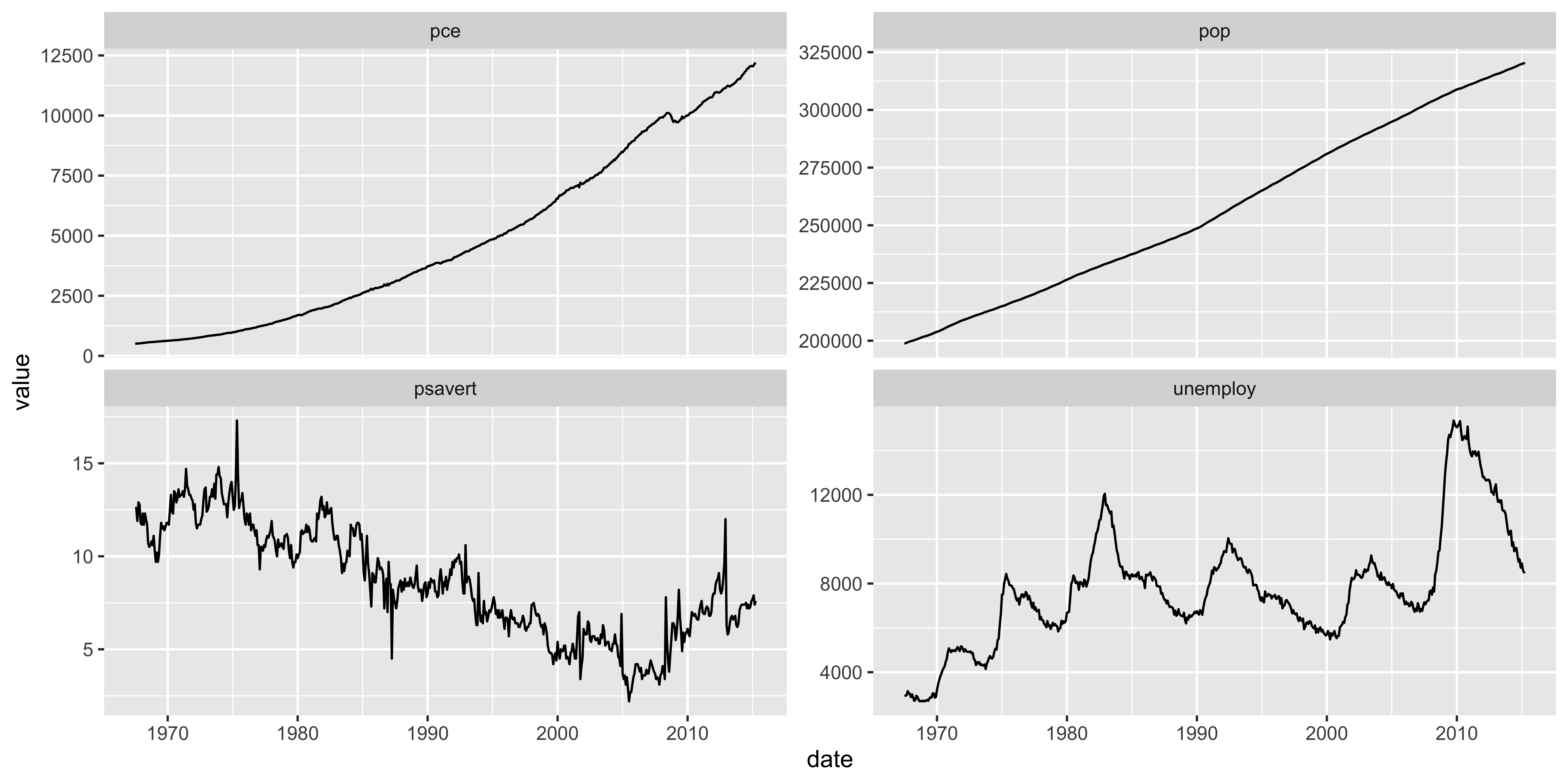
For this exercise problem, we will use economics dataset from the ggplot2 package. You need to use data manipulation and visualization techniques using the data.table and ggplot2 packages.
- As you already know by now, the
economicsdataset contains various economic indicators for the United States. We want to create a line plot showing the trends of all economic indicators over time. Each economic indicator is stored in a separate column in the data, and you can visualize each indicator by creating a single line plot, separately. But, there is a better way to do this. It should look like the following plot.
For this exercise problem, you will use “corn_yield_dt.rds” in the “Data” folder. I obtained this from USDA-NASS Quick Stats database. The data contains the county-level corn yield data (in BU / ACRE) for each major corn production state in the US Midwest from 2000 to 2022.
Load the data and take a look at it.
Convert the data to a
data.tableobject. TheValuecolumn contains the corn yield data. Rename the column toyield.Let’s derive the state-level annual average corn yield data by calculating the mean of corn yield by state and year. Create a line plot of the annual trend of corn yield in Minnesota by taking
yearfor the x-axis and the derived mean yield for they-axis.Create line plots showing the trend of annual corn yield for each state in the same plot.
Create a facet plot showing each state’s annual corn yield trend. To compare the trends across states, use
scales = "fixed".
Hint: state_alpha is the two-letter state abbreviation for each state.
- Create a new dataset that contains the overall average corn yield across states by taking the mean of the
yieldbyyear. Add a line plot of this dataset to the plot you created in the previous step. Use red dashed line to represent this line.
- If you could add a legend to the plot to indicate what the red dashed line means, that would be great! To do this, you need to use
scale_color_manual()function.